Best Premium and Free WordPress Themes › Forums › Portfolio Web › Header image not scaling on mobile
Tagged: header, header image, mobile, Scaling
- This topic has 4 replies, 3 voices, and was last updated 4 years ago by
kalp23.
-
AuthorPosts
-
June 20, 2019 at 4:04 pm #55768
mormonjesus69420
ParticipantHello!
My website is salwerowi.cz, I have a problem with the header image on main page not scaling for mobile devices, instead it cuts it on both sides. However if I go to blog page, that uses same picture as header image, it is scaled properly instead of being cut.
Is it possible to fix it, so that header image on main page is being scaled too? Like do I need to edit some CSS or JavaScript code for it to work?
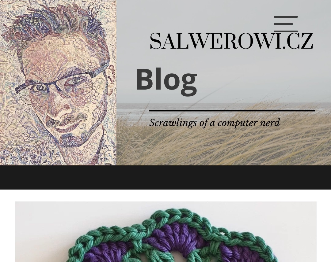
Unscaled header image on main page:

Scaled header image on blog page:
-
This topic was modified 4 years, 4 months ago by
mormonjesus69420. Reason: Fixed image links
-
This topic was modified 4 years, 4 months ago by
June 21, 2019 at 5:37 pm #55836acmesupports
ParticipantDear mormonjesus,
Please use the following css code to adjust scale image in small devices.
Appearance > Customize > Additional CSS@media (max-width:767px){ .image-slider-wrapper .slick-list, .image-slider-wrapper .slick-track{ height:35vh !important; } }Note: You can adjust the height value as per your requirement.
Best Regards!
June 21, 2019 at 6:16 pm #55846ParticipantThat a lot! That helped!
June 22, 2019 at 3:25 pm #55897ParticipantDear mormonjesus,
You are Most Welcome 🙂
Best Regards!October 1, 2019 at 5:02 pm #70379kalp23
ParticipantThank You Very Much This Article Really Helped me
God will DO Good For You -
This topic was modified 4 years, 4 months ago by
-
AuthorPosts
- You must be logged in to reply to this topic.